
How to Decorate With Color Without Overdoing It
Decorating with color can completely change the atmosphere of a home. The right shades can make a room feel brighter, warmer, calmer, more luxurious, or even more spacious. However, many people struggle with using color because they fear making their space feel too loud or visually overwhelming. It is very easy to fall into the habit of adding too many bright tones, mixing unrelated colors, or filling every corner with decorative pieces. As a result, the room may begin to feel cluttered instead of beautiful.
The truth is that good color decorating is not about using more color. It is about using color with balance and purpose. A thoughtfully designed room does not depend on bold paint everywhere or overly dramatic furniture. Instead, it relies on harmony between tones, textures, lighting, furniture placement, and decorative accents. When color is introduced carefully, it creates personality while still allowing the room to feel peaceful and comfortable.
Many professionally designed homes actually use color in subtle ways. They combine soft foundations with controlled accents, natural textures, and visual breathing space. This creates interiors that feel elegant and timeless rather than trendy or overwhelming. Understanding how colors interact with each other can help you avoid common decorating mistakes and create a home that feels balanced every single day.
In this guide, you will learn practical and realistic ways to decorate with color without overdoing it. Every section explains how to use color more intentionally so your home feels stylish, inviting, and visually relaxing.
Understand the Purpose of Color in Interior Design
Before adding color to a room, it is important to understand why color matters in interior design. Color is not only decorative. It also affects mood, energy, comfort, and even how large or small a room appears.
Soft and muted colors usually create a calming atmosphere. This is why shades like light beige, pale gray, sage green, dusty blue, and warm white are often used in bedrooms and relaxing spaces. On the other hand, vibrant colors like red, orange, and bright yellow create energy and stimulation. These shades can work beautifully in moderation, especially in creative areas or social spaces.
Color also changes the visual proportions of a room. Light tones reflect more light and make spaces feel open and airy. Dark shades absorb light and create depth, warmth, and intimacy. Understanding this principle helps you choose colors that support the feeling you want to create instead of making the room feel uncomfortable.
When color is used intentionally, it supports the design instead of dominating it. Every color should have a purpose rather than being added randomly.
READ MORE: Easy Birthday Scrapbook Ideas for Stunning DIY Memory Books
Start With a Calm and Neutral Base
One of the safest and most effective ways to decorate with color is by building the room around a neutral foundation. Neutral colors provide stability because they create visual balance and allow accent colors to stand out naturally.
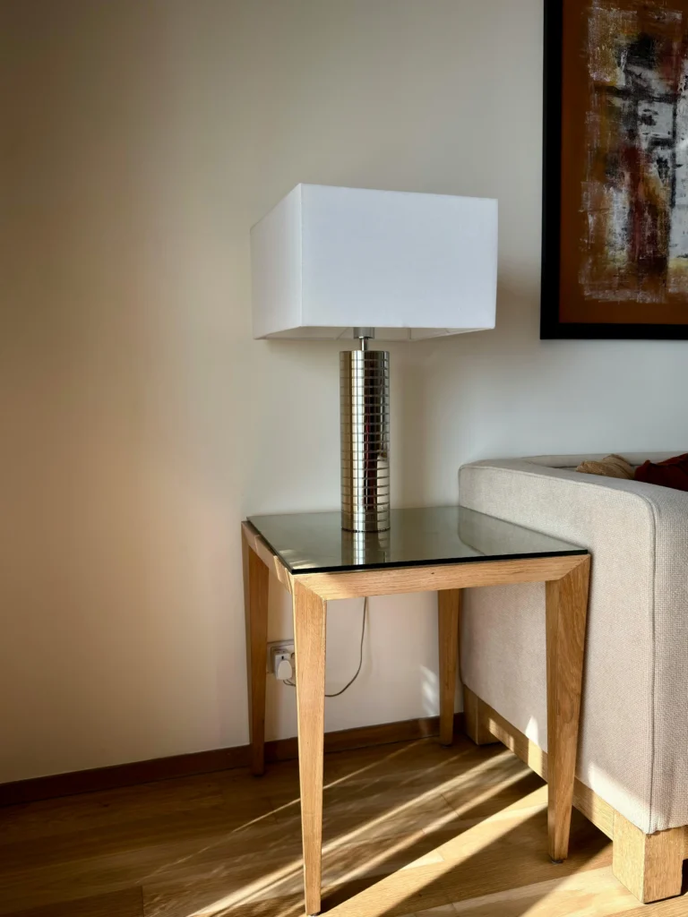
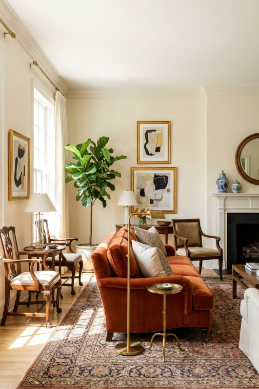
Walls, flooring, sofas, large cabinets, and major furniture pieces are usually best kept in neutral tones. Colors like cream, ivory, taupe, beige, soft gray, warm white, or muted brown create a clean background that supports other decorative elements.
A neutral base gives you more freedom when introducing colorful accessories later. For example, a cream sofa can work beautifully with blue, green, rust, black, blush, or mustard accents, depending on the season or your style preferences. This flexibility prevents the room from becoming outdated too quickly.
Neutral spaces also feel calmer because they reduce visual pressure. Instead of competing for attention, colorful accents become carefully placed highlights that guide the eye naturally throughout the room.
Learn the Difference Between Warm and Cool Colors
One of the most overlooked parts of decorating with color is understanding warm and cool tones. Even beautiful colors can feel uncomfortable together if their undertones clash.
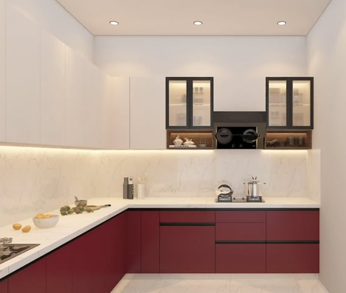
Warm colors include shades with yellow, orange, or red undertones. These colors create coziness, warmth, and energy. Examples include terracotta, warm beige, mustard, caramel, olive green, and creamy whites.
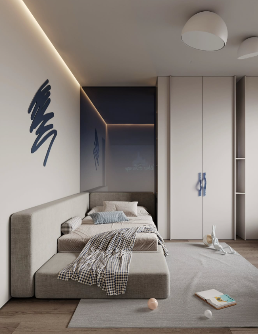
Cool colors contain blue, gray, or purple undertones. These colors create calmness and freshness. Examples include icy gray, navy blue, sage green, cool white, charcoal, and dusty blue.
Mixing too many warm and cool shades without balance can make a room feel disconnected. However, combining them carefully creates harmony and depth. For example, a warm wooden table can balance cool gray walls beautifully. Likewise, soft beige curtains can soften a dark navy sofa.
Paying attention to undertones helps create a smoother and more polished overall design.
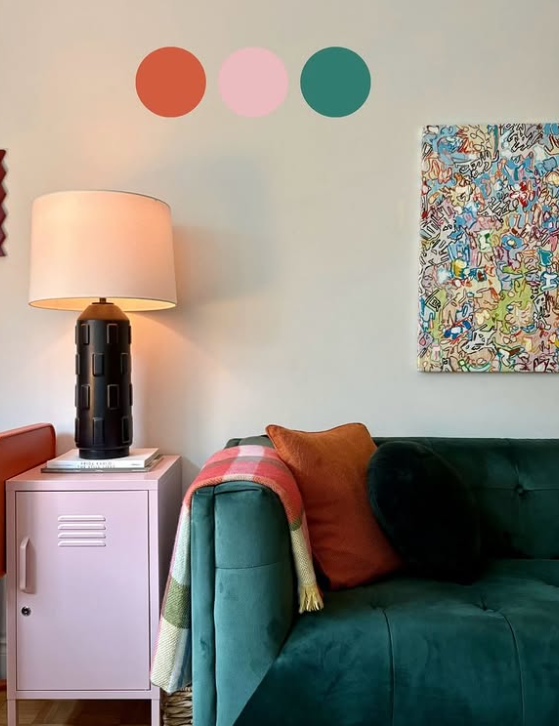
Use the 60 30 10 Rule for Better Balance
The 60 30 10 rule is one of the simplest ways to prevent color overload in a room. This design method creates a natural balance by dividing colors into proportions.
The dominant color should cover about 60 percent of the room. This usually includes walls, large furniture, flooring, or major visual surfaces. Most people choose a neutral or soft tone for this area because it creates calmness and flexibility.
The secondary color covers about 30 percent of the room. This color adds personality and may appear in curtains, chairs, bedding, rugs, or decorative furniture.
The final 10 percent should be your accent color. These are the small details that add visual interest, such as pillows, artwork, candles, books, flowers, or decorative objects.
This system works because it prevents every color from fighting for attention. Instead, the eye naturally moves through the room in a balanced way.
Choose One Main Accent Color
One of the most common decorating mistakes is using too many accent colors at once. Although colorful rooms may seem exciting at first, excessive color variety often creates visual stress over time.
Instead of adding multiple bold shades everywhere, focus on one primary accent color. This color becomes the main personality of the room and appears repeatedly in controlled ways.
For example, if your chosen accent color is deep green, you might use green cushions, artwork, vases, and plants throughout the space. Repeating the same accent color creates consistency and makes the room feel professionally styled.
You can still include smaller supporting tones, but they should not overpower the main accent color. Controlled repetition creates elegance because the room feels intentional rather than random.
Add Color Gradually Instead of All at Once
Many people become overwhelmed because they try to redesign an entire room with color immediately. A better approach is to add color slowly over time.
Start with small decorative pieces first. Cushions, throws, artwork, candles, lamps, flowers, books, trays, and rugs are easy ways to experiment with color without making permanent decisions.
This gradual method helps you understand how different colors feel inside your home. Some shades may appear brighter or darker depending on lighting conditions, furniture, and surrounding textures.
Adding color slowly also helps you avoid expensive decorating mistakes. Instead of replacing large furniture pieces later, you can adjust smaller accessories until the room feels balanced.
Use Texture to Make Color Feel Softer
Texture plays a major role in how color is perceived. The same color can feel completely different depending on the material it appears on.
For example, bright blue velvet feels rich and luxurious, while bright blue plastic may feel harsh and overwhelming. Similarly, earthy green linen appears softer and more natural than glossy green surfaces.
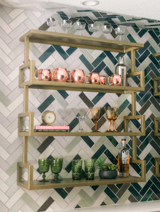
Natural textures help colorful rooms feel more comfortable and grounded. Materials like wood, linen, cotton, wool, leather, jute, stone, and rattan soften strong colors and add depth to the space.
Layering textures also prevents the room from feeling flat. Instead of relying only on color for visual interest, texture creates warmth and balance naturally.
Pay Attention to Lighting Before Choosing Colors
Lighting changes color more than most people realize. A paint color that looks soft and warm in a showroom may appear cold or dull inside your home.
Natural sunlight, window direction, lamp placement, ceiling height, and bulb temperature all influence how colors appear throughout the day. Rooms with strong sunlight can usually handle slightly darker or richer shades because natural light keeps them balanced.
On the other hand, darker rooms often need lighter tones to prevent the space from feeling closed in. Warm whites, soft beiges, muted greens, and pale grays usually work well in low-light areas because they reflect light more effectively.
Always test colors under real lighting conditions before making final decorating decisions. Observe them in the morning, afternoon, and evening to see how they shift naturally.
Avoid Filling Every Surface With Color
A balanced room needs visual breathing space. If every wall, shelf, chair, curtain, and accessory contains strong colors or patterns, the room may start feeling visually exhausting.
Space is just as important as decorative detail. Calm areas allow colorful accents to stand out more effectively. This is why many elegant interiors include simple walls, open surfaces, and uncluttered furniture arrangements.
For example, if you already have a colorful rug and bold artwork, you may not need bright curtains or heavily patterned cushions as well. Allow one or two pieces to become focal points while the rest of the room supports them quietly.
This approach creates sophistication because the eye can focus comfortably without becoming overwhelmed.
Use Plants as Natural Color Elements
Plants are one of the safest and most effective ways to introduce color into a home. Greenery adds freshness, texture, and life without creating visual heaviness.
Unlike artificial decorative colors, natural green tones usually blend beautifully with most interiors. Plants also soften furniture edges and make rooms feel more relaxed and welcoming.
Large plants can fill empty corners naturally, while smaller plants work well on shelves, tables, or windowsills. Combining plants with neutral interiors creates a clean and balanced aesthetic that never feels excessive.
Natural materials like terracotta pots, woven baskets, or ceramic planters can further soften the appearance of colorful spaces.
Create Color Harmony Between Rooms
When decorating an entire home, color flow becomes very important. Every room does not need identical colors, but the shades should feel connected in some way.
For example, if your living room includes earthy olive accents, you might continue similar warm tones in nearby spaces through artwork, fabrics, or decorative objects. This creates continuity and makes the home feel more thoughtfully designed.
Without harmony between rooms, the home may feel visually disconnected. Moving from one intense color scheme to another can feel overwhelming and uncomfortable.
Repeating small elements throughout the home creates a smoother and more relaxing overall atmosphere.
Know When Simplicity Looks Better
One of the most important skills in decorating is learning when to stop adding more. Many people believe that more accessories, more patterns, and more color automatically create a stylish room. In reality, simplicity often creates a stronger visual impact.
If a room already feels balanced, adding extra decorations may reduce its elegance. Sometimes removing unnecessary items improves the design more than buying new ones.
A carefully edited room usually feels calmer, cleaner, and more timeless. Instead of filling every corner, focus on quality over quantity. Meaningful decorative choices create personality without making the space feel crowded.
Balanced decorating is about intention rather than excess.
Final Thoughts
Learning how to decorate with color without overdoing it is about creating harmony between beauty and comfort. Color should enhance your home, not dominate it. By starting with neutral foundations, understanding undertones, using controlled accent colors, layering textures, respecting lighting, and leaving visual breathing room, you can create interiors that feel stylish and peaceful at the same time.
A balanced, colorful home does not rely on extreme trends or overwhelming design choices. Instead, it reflects thoughtful decisions, personal comfort, and timeless style. When color is used carefully, it adds warmth, personality, and depth while still allowing the space to feel calm and inviting every single day.